Acer Brand Identity
Amidst a crowded global PC market, Acer began to undergo a series of transformations guided by the leadership of a new CEO, Jason Chen. These transformations recognized that, to stand out, Acer had to elucidate its brand identity and lean into its core values. Acer aimed to transition from the status of a value product manufacturer to a lifestyle brand. But to change consumers’ perception of the Acer brand and the role it plays in their lives, Acer needed to communicate its true, authentic self to its audience.
Our approach
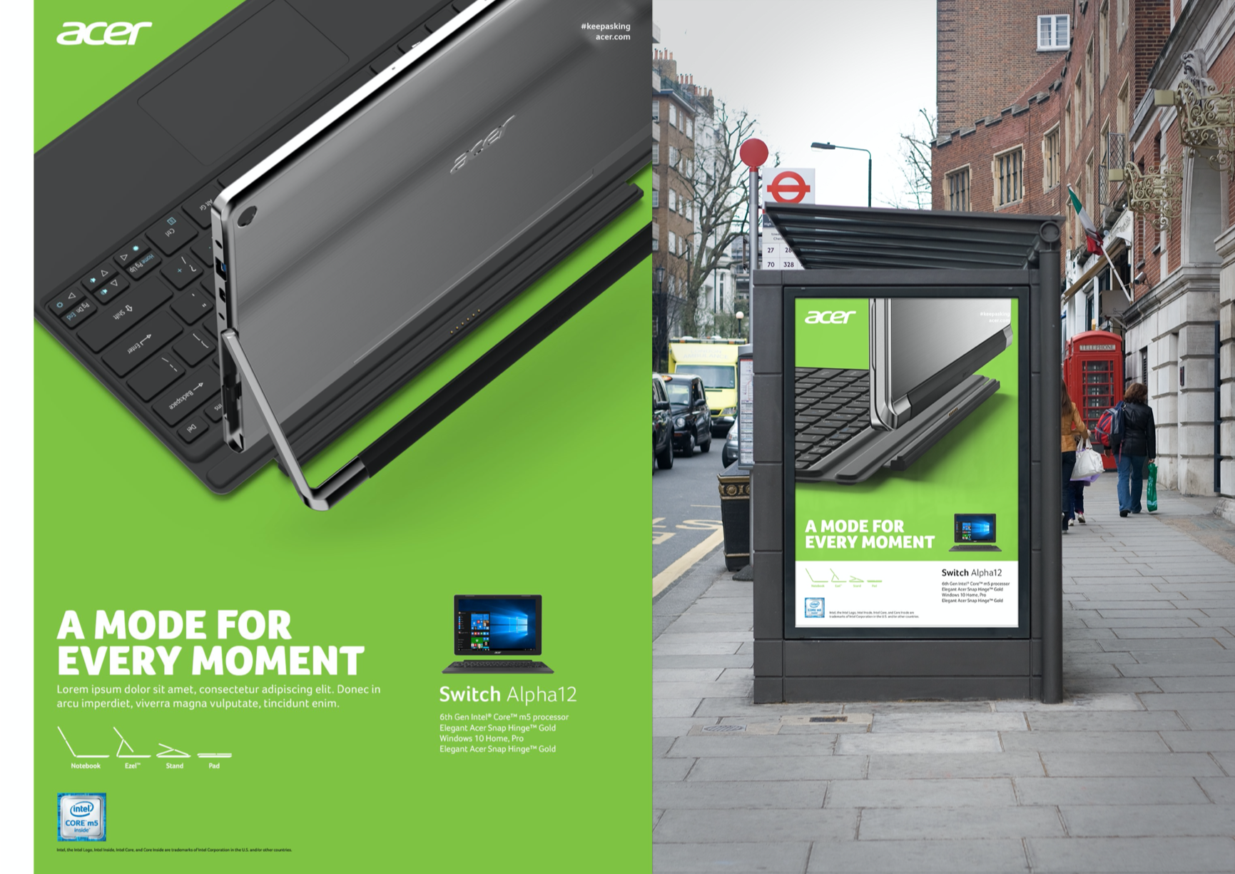
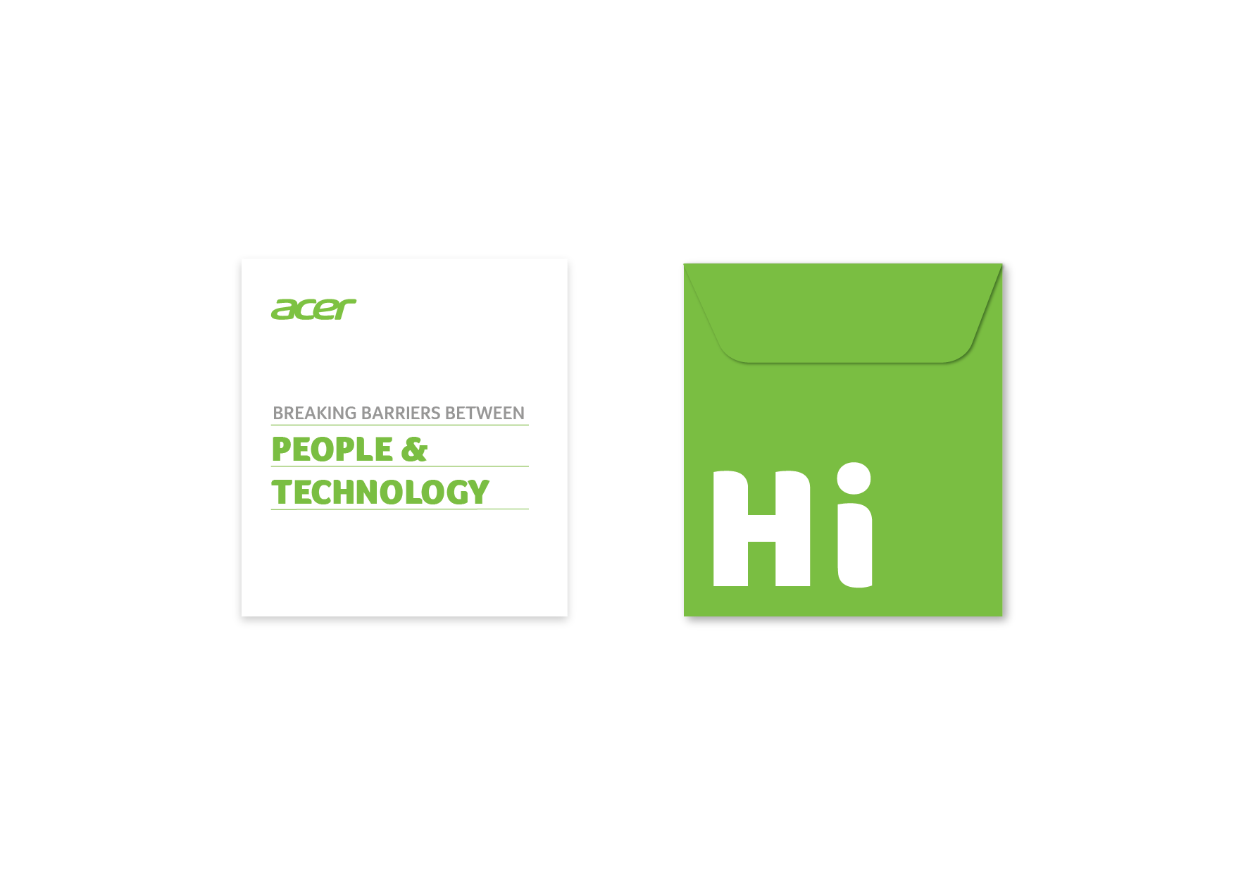
Working with Acer’s team, our starting point was to take a visual approach. To connect more closely with Acer’s customer base, the brand needed a visual identity that exemplified its DNA under its new leader’s guidance. Acer is a curious, progressive, and human brand, and we ensured these fundamental characteristics are evident in every consumer touchpoint. The brand’s color is a vibrant green that mimics the growth and rebirth of a new spring. We created a friendly and professional typeface whose curves and edges hint at Acer’s charismatic nature. Fittingly, the brand’s new tone and manner is warm, inviting, and a little bit chatty—just like a real person. This new visual identity helped breathe life into Acer’s soul and set the foundation for how the brand would continue to bond more deeply with every member of the Acer family and community.
Learn more