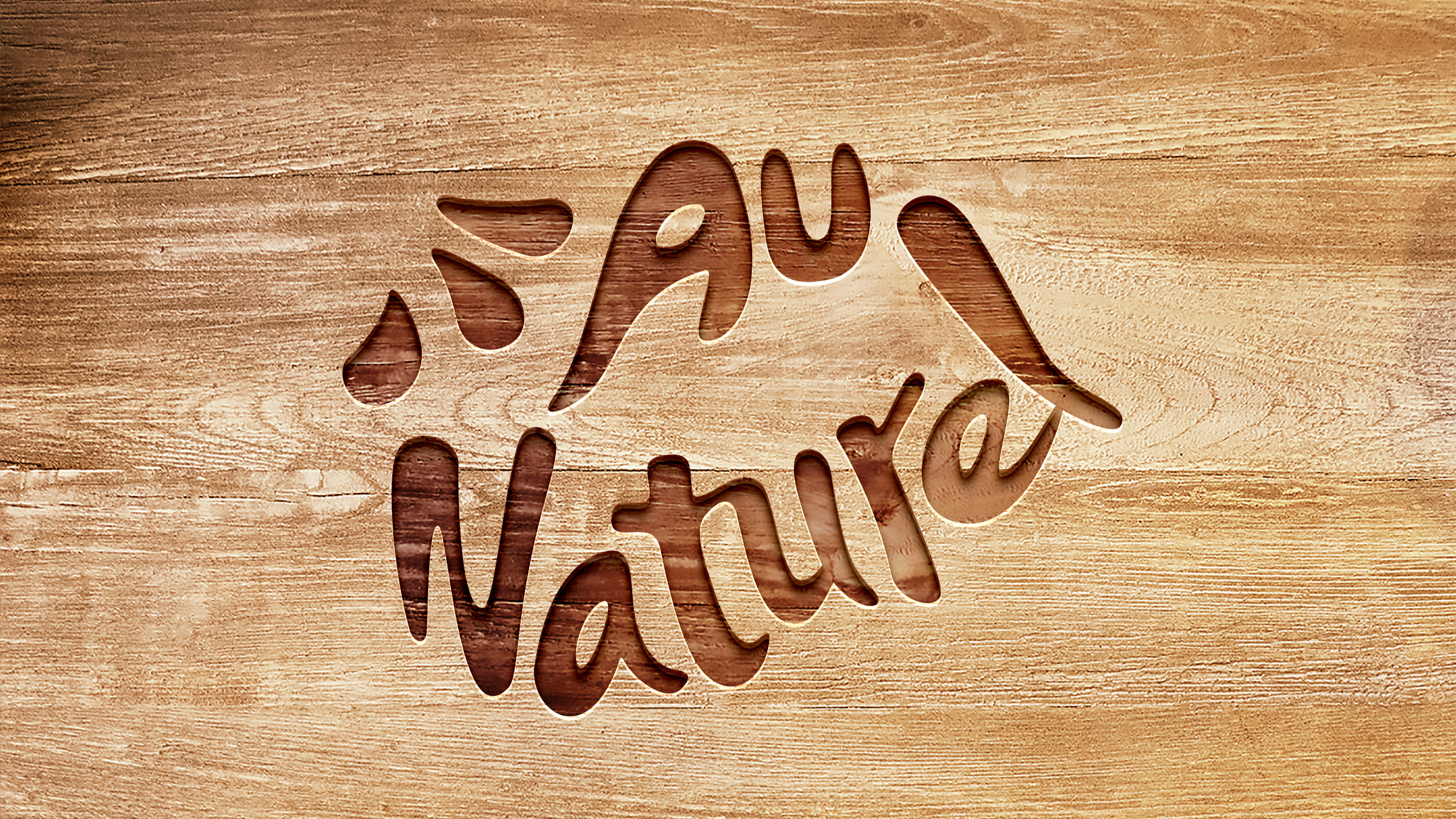
Au Naturel Brand Identity
Au Naturel is a young brand that produces organic food and beverage products. The founder is committed to making quality and healthy food with “nothing but water and the fruit itself.” Like their recipe, we needed to create the brand identity from scratch and help Au Naturel go to market. With the goal to make organic food and beverage products accessible to all, we needed to go beyond the confines of organic specialty stores and introduce Au Naturel to mainstream channels. This also meant we needed to identify the brand’s key differentiators to stand out in the mass organic food market.
Our approach
Our goal was to communicate “100% natural” in an intuitive way and convey the brand’s essence and transparency through our design. Echoing the brand’s mission, the name “Au Naturel” was chosen because it means “with no elaborate treatment, dressing, or preparation” and “naked” in French. To further convey the brand’s natural, simple, and authentic qualities, we designed the logo with a hand-drawn font and rounded curves that allude to the shape of the mouth. The three dots in the upper left corner represent the figurative “seeds” of organic ingredients— sun, greenery, and soil.
Learn more
