SATORO Brand Identity
The project was to create visually compelling branding for Satoro, a leading provider of agile and universal satellite solutions. The goal was to create a design that would highlight Satoro's goal of accelerating commercial access to small satellites by focusing on Satoro's unique strengths, including their streamlining of the mission-ready testing process, turnkey solutions, and proven operational experience.
Our approach
To achieve the design goal, we thoroughly analyzed the satellite industry, competition, and market. We then developed a brand strategy that emphasized Satoro's key attributes and positioned them as a visionary company redefining space possibilities.
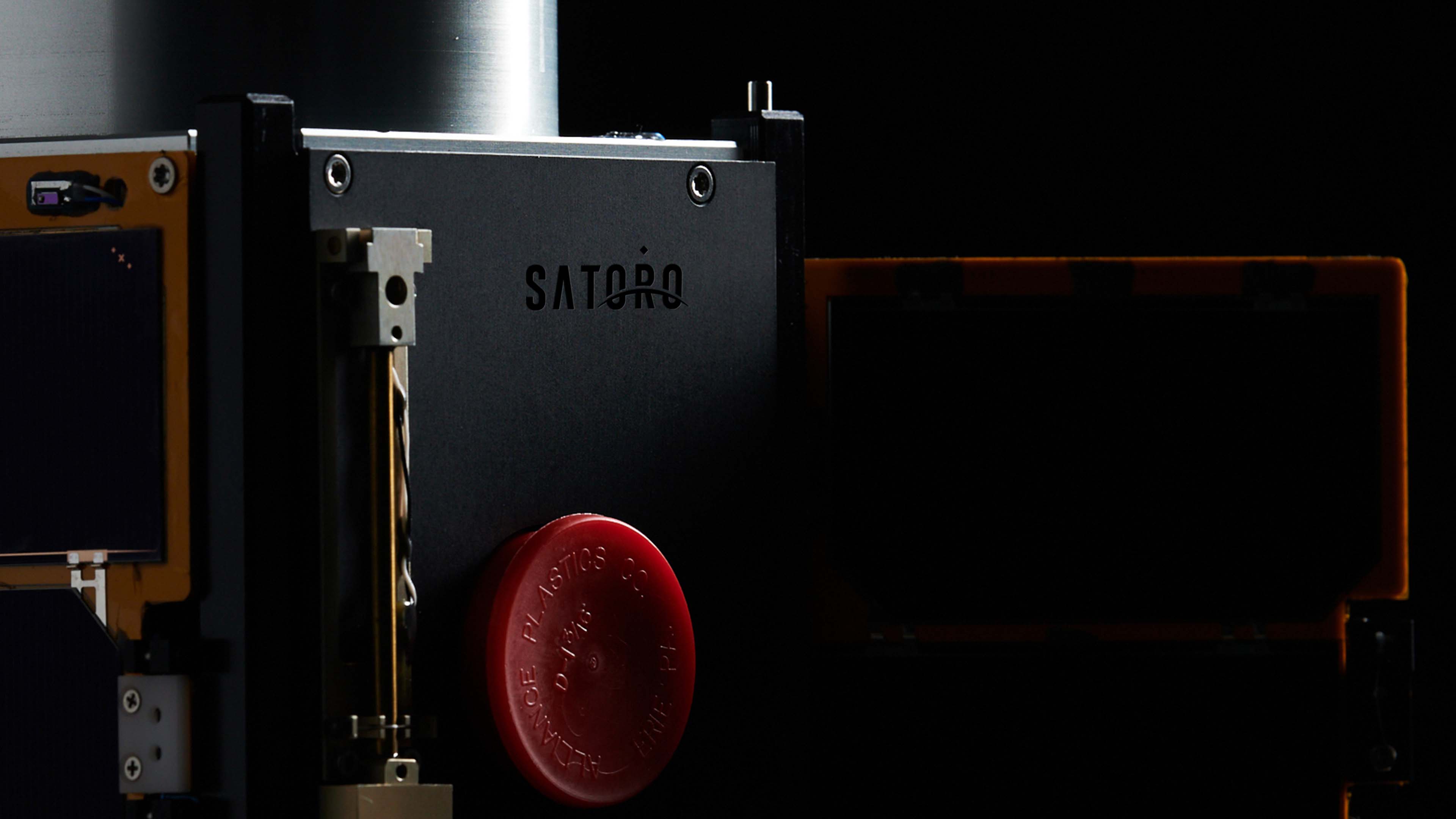
We created a visual identity system with a new logo, color palette, typography, and imagery to communicate Satoro's strengths and differentiate them from their competitors. Inspired by the abbreviation of the word satellite "sat", and "oro" meaning gold in Latin, Satoro represents the new golden age of space exploration and reflects the gold standard of service Satoro provides. As a result, the color palette infuses elements of space and utilizes gold as the primary accent color.
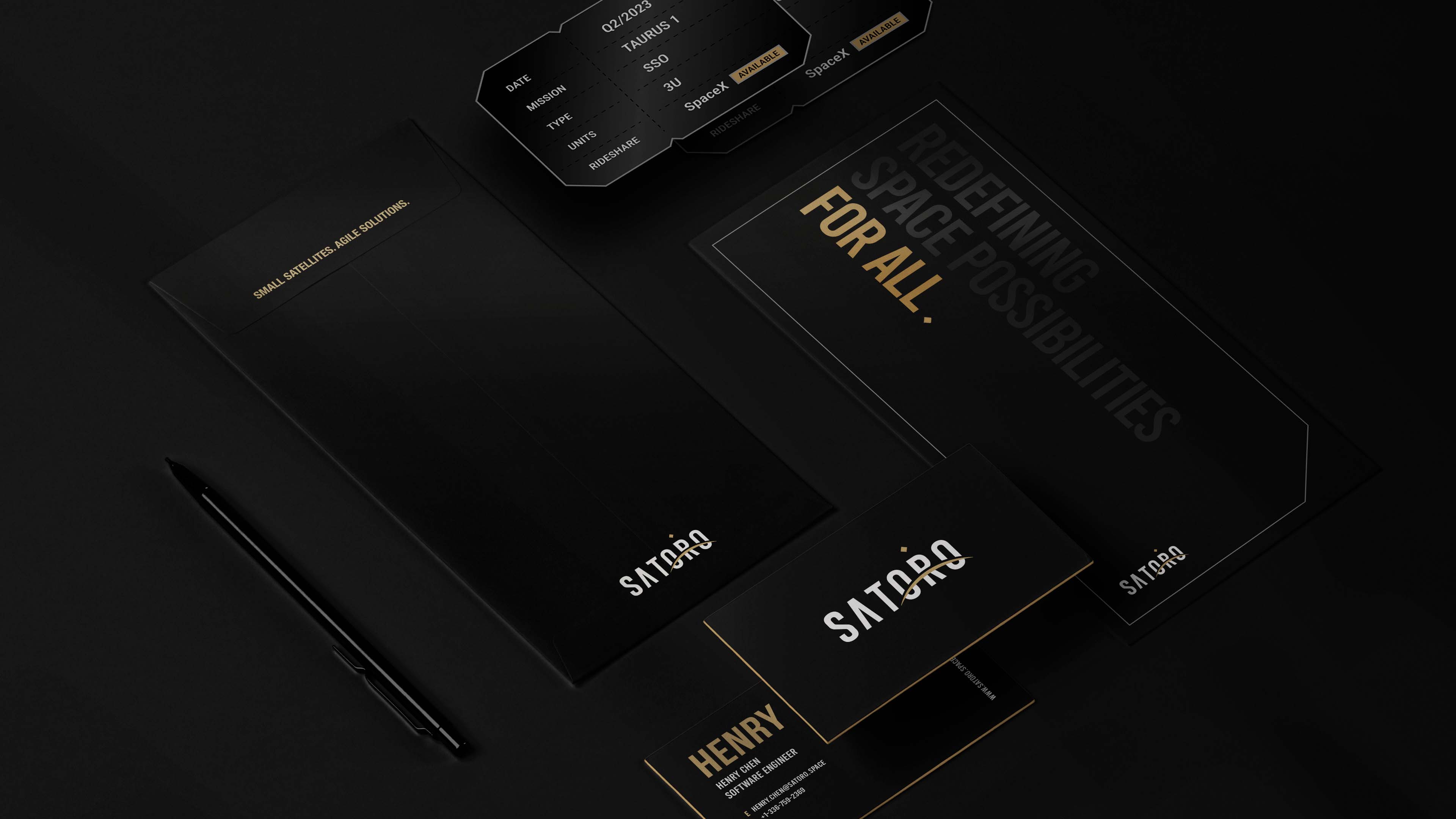
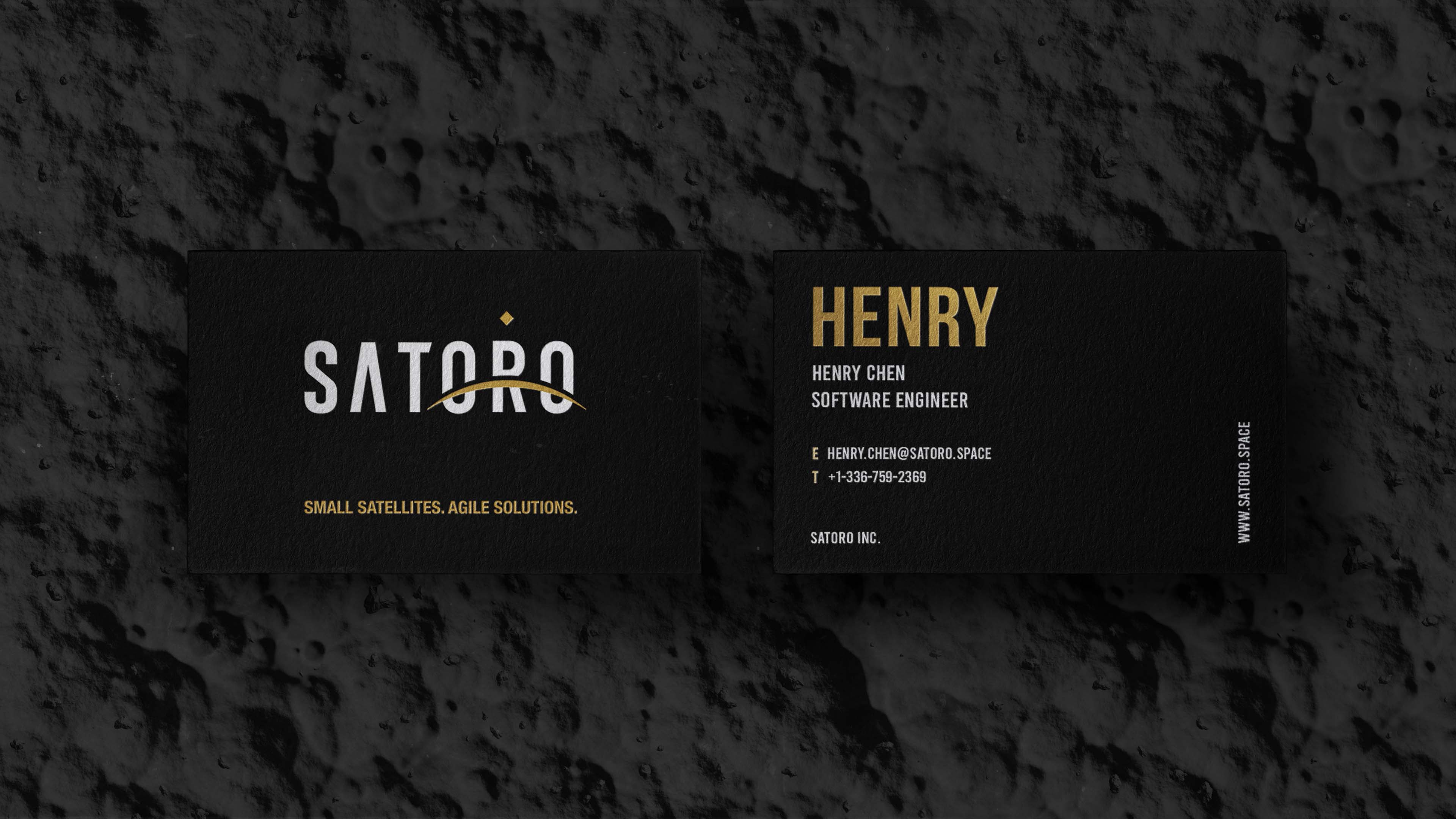
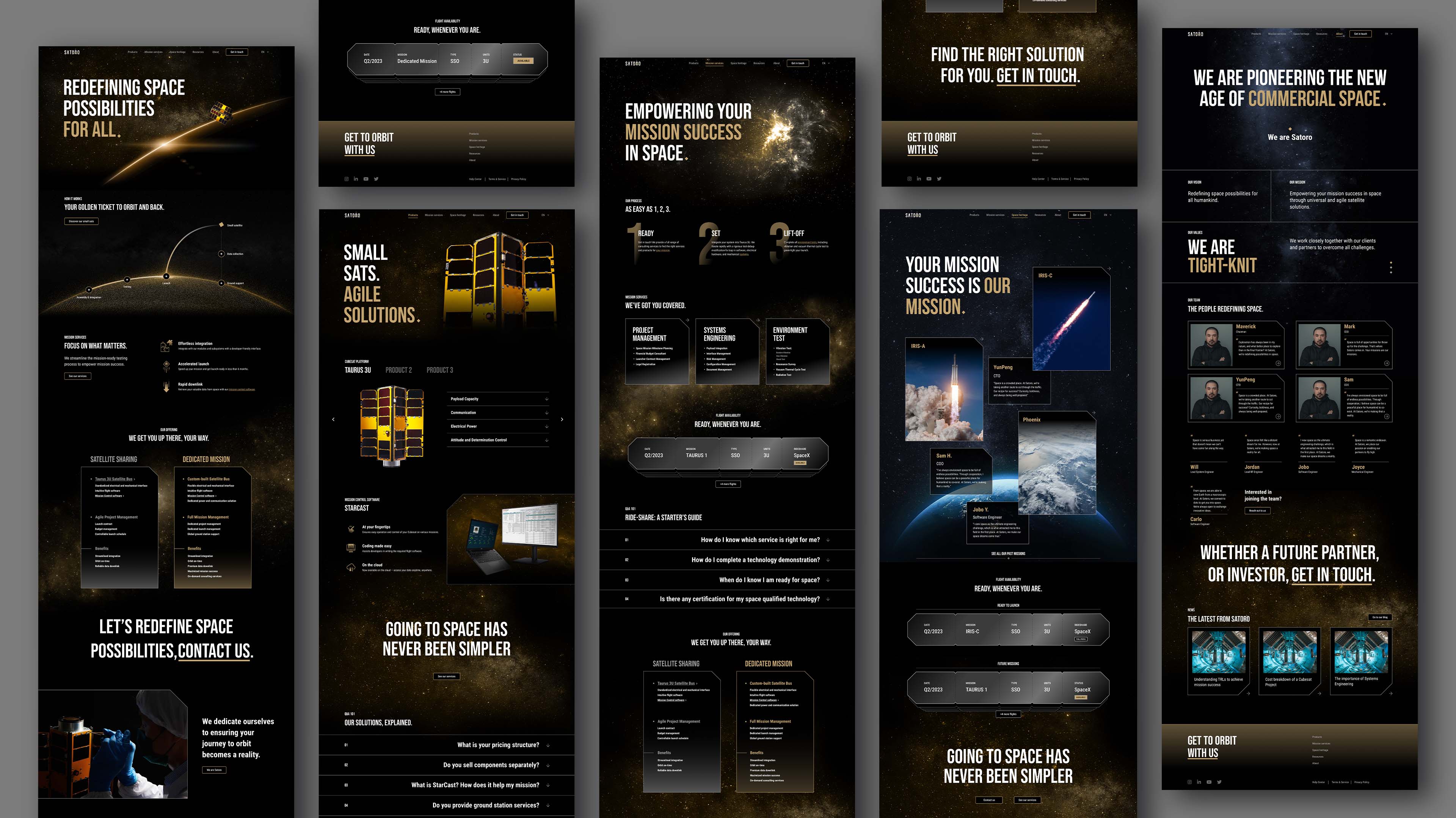
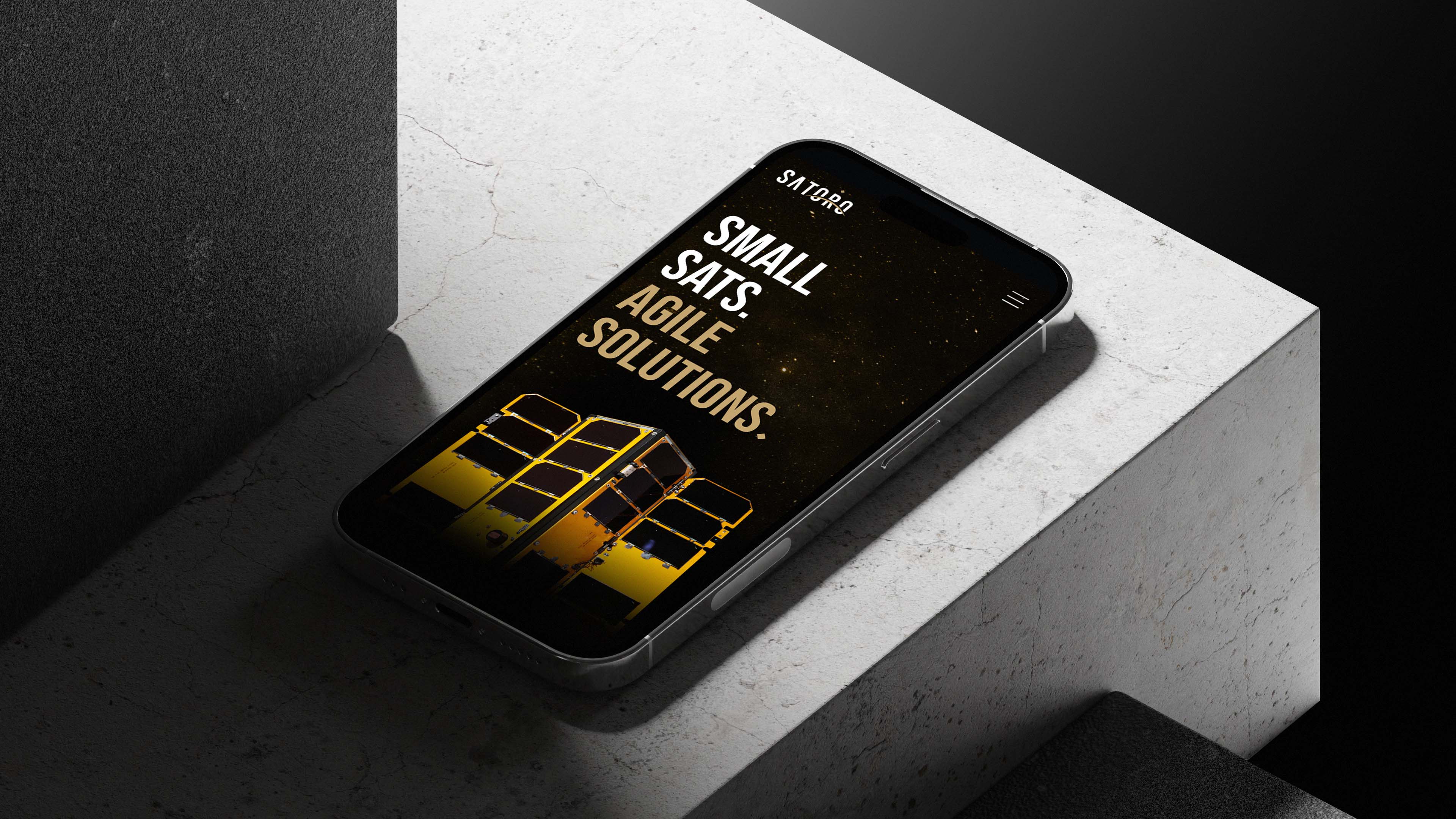
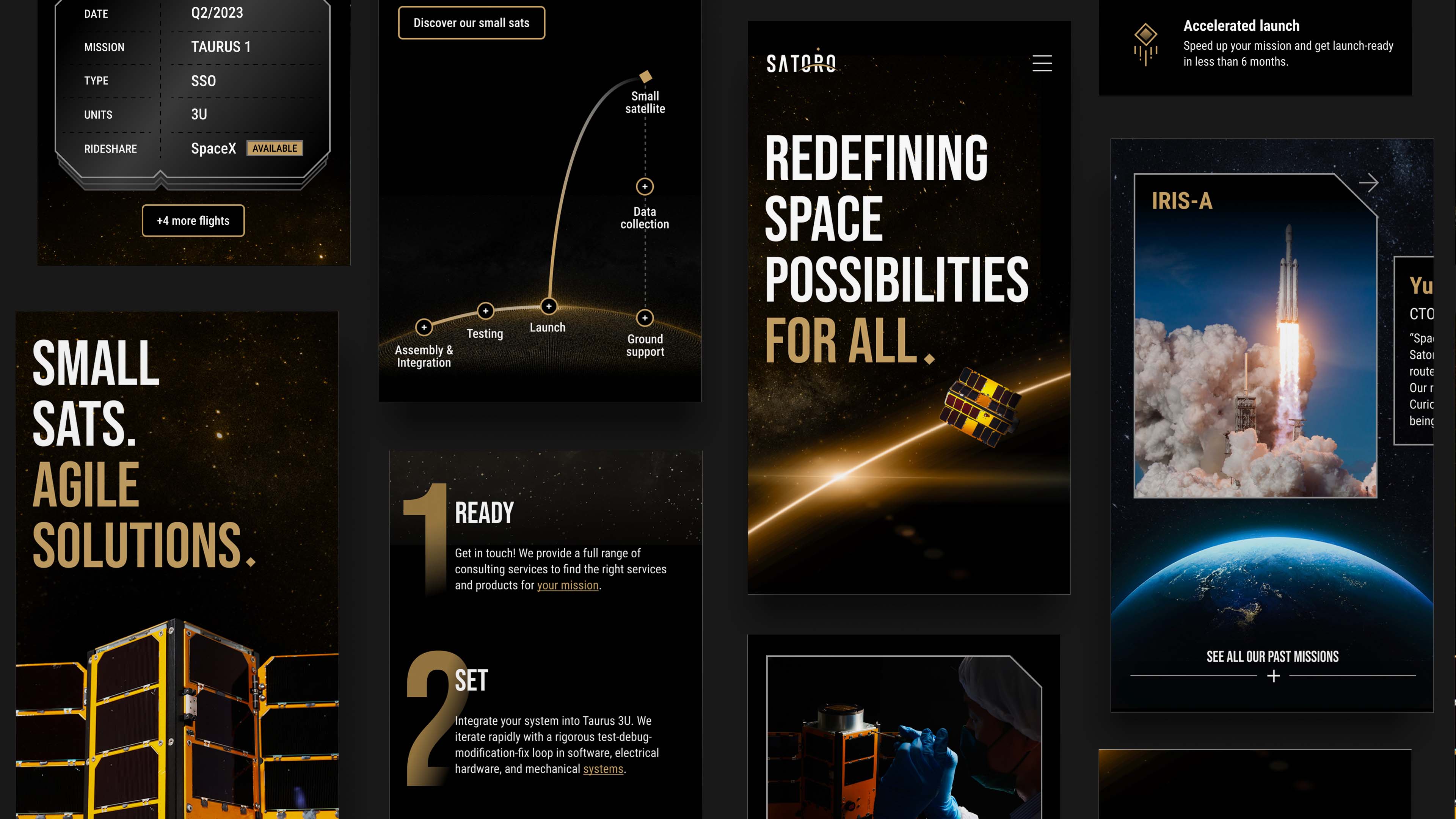
The horizon line treatment in the logo reflects the streamlining of the process to orbit. Satoro's website leverages this treatment throughout the design by visualizing the path of a small satellite. The website features clear messaging, bold imagery, and a streamlined user experience highlighting Satoro's value proposition. We aspired to represent the vastness of space by using a dark background color with gold highlights and product photography that stand out from the void. The website, layout, and sections cleverly use the angular shapes of satellite components. We also designed marketing collateral, such as business cards, outdoor key visuals, and small satellite mock-ups that would ensure consistency across all communications.
Visit Satoro's website
